Scorecard Highlights
The 2018 Scorecard finds more improvement than decline between 2013 and 2016 in the functioning of state health care systems.
All 50 states and the District of Columbia were assessed on more than 40 measures of access to health care, quality of care, efficiency in care delivery, health outcomes, and income-based health care disparities.
612 Indicators
Improving
259 Indicators
Worsening
Across all states on 43 indicators of health care system performance
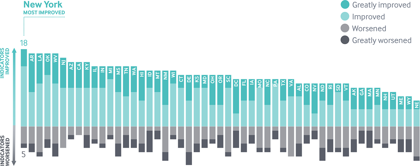
Which states improved on the most indicators?
New York improved on 18 of the 37 indicators we track over time — the most of any state. Arkansas, Louisiana, Oklahoma, and West Virginia each improved on 17 indicators.
Overall health system performance varies greatly among states
- Adjust the options to see how states performed when compared to the baseline, against other states in their region, and in different dimensions.
- Highlight a state by selecting its circle
States are arranged in rank order from left (best) to right (worst), based on their 2018 Scorecard rank.
States are arranged in rank order from top (best) to bottom (worst), based on their 2018 Scorecard rank.
How does performance vary regionally?
New England, the Upper Midwest, and several states in the West are at the top of our overall rankings. Southern states generally rank at the bottom. The Scorecard shows how states perform relative to their geographic neighbors.
State health system performance varies within regions
- Select a state to highlight a region of the country.
- Choose a selected state to return to the national view.
Note: Regions are U.S. Census regions. Regional shading is based on performance among states within the region only. See Scorecard Methods for additional detail.
What’s the trend?
Following a long period of decline, premature death rates are flattening or trending upward in many states. Nonetheless, across all dimensions of performance there was more improvement than decline between 2013 and 2016 — a reversal of what happened during the 2000s, when progress stalled or worsened.
More improvement than decline
Notes: Based on trends for 37 of 43 total indicators (Disparity dimension not included); trend data are not available for all indicators. Bar length equals the total number of indicators with any improvement or worsening with an absolute value greater than 0.5 standard deviations (StDev) of the state distribution. Lighter portion of bars represents the number of indicators with a change of 0.5–0.9 StDevs between baseline and current time periods, darker portions represent indicators with 1.0 or greater StDev change.