Rising to the Challenge
Highlights from the Scorecard
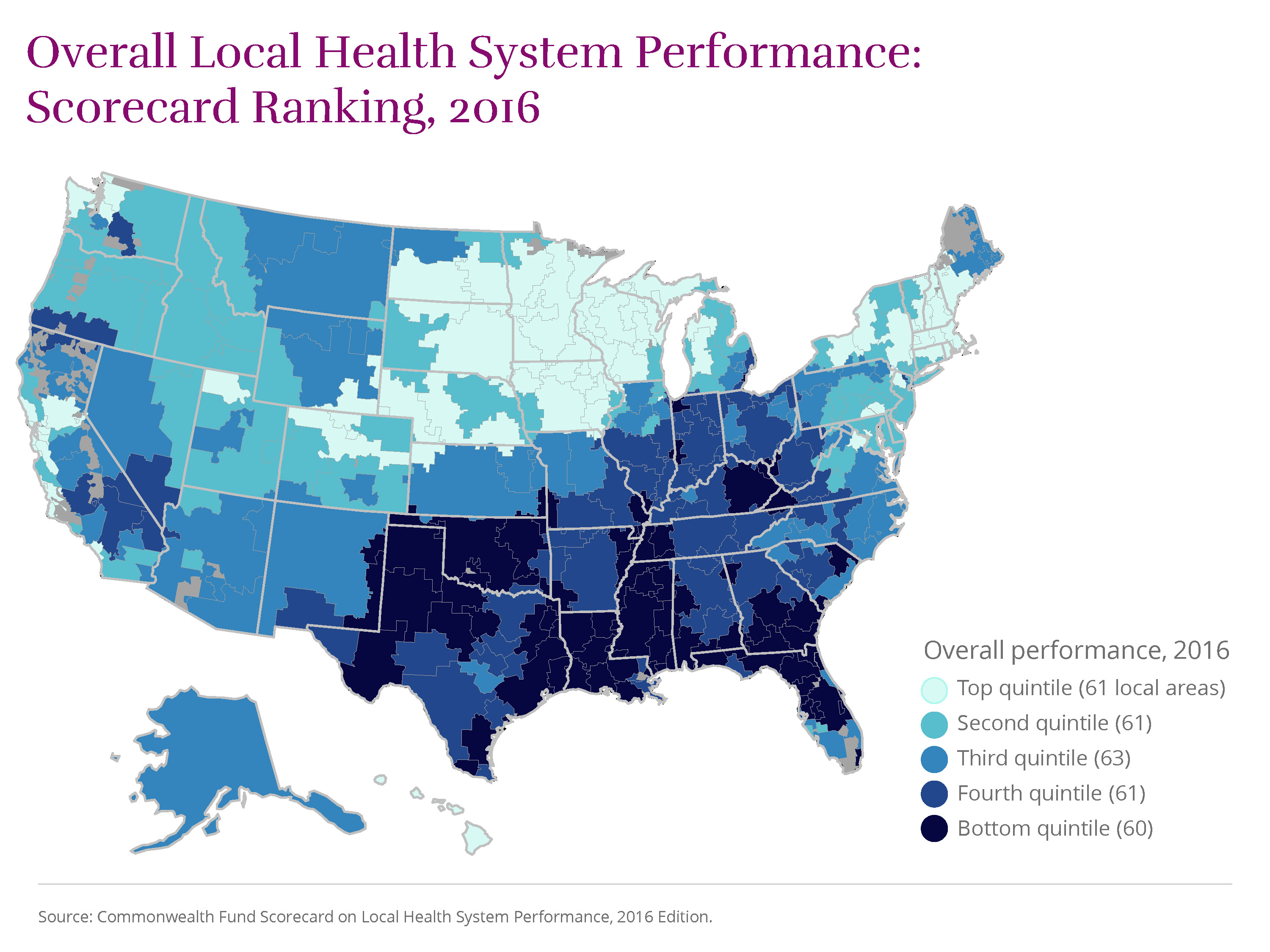
This 2016 edition of The Commonwealth Fund’s Scorecard on Local Health System Performance assesses the state of health care in more than 300 U.S. communities from 2011 through 2014, a period when the Affordable Care Act was being implemented across the country. In comparing health care access, quality, avoidable hospital use, costs of care, and health outcomes, the Scorecard shows that many U.S. communities experienced improvements: fewer uninsured residents, better quality of care in doctors’ offices and hospitals, more efficient use of hospitals, and fewer deaths from treatable cancers, among other gains. Still, the persistence of widespread differences between areas is a reminder that many local health systems have yet to reach the potential attained elsewhere in the country.
Using the most recent data available, the Scorecard ranks 306 regional health care markets known as “hospital referral regions” on four main dimensions of performance encompassing 36 measures. Top-ranked regions in Hawaii, the Upper Midwest, New England, and the San Francisco Bay area have been performance leaders over time, and they offer achievable improvement benchmarks for policymakers, health system leaders, and community stakeholders.
View Map
 .
.
This 2016 edition of The Commonwealth Fund’s Scorecard on Local Health System Performance is the second in the series. The first was released in 2012.
The 2016 Scorecard measures changes in local area performance over recent years for which data are available, generally 2011 through 2014 for most indicators. Although many indicators reported here overlap with those reported in the 2012 edition, changes in underlying data sources or measure definitions required that we re-base each performance indicator. Thus, this Scorecard should not be interpreted as a strict update of the 2012 edition.
In this report, we examine changes in local performance on the 33
indicators
For methodological reasons, trends for three performance indicators could not be calculated.
we were able to track over time.
The good news: in nearly all U.S. communities, performance in recent years improved more often than it worsened, showing that progress is possible with supportive policies and local action. Still, in many places there was little or no meaningful change on many of our indicators of health and health care. As a consequence, only
14
Akron, OH
Stockton, CA
Cape Girardeau, MO
Wichita Falls, TX
San Francisco, CA
Santa Rosa, CA
Royal Oak, MI
Longview, TX
Santa Cruz, CA
Boulder, CO
Paducah, KY
Columbia, MO
Chico, CA
Pueblo, CO
U.S. localities improved on a majority of the Scorecard’s indicators (17 or more).
Continuing geographic variability in health and health care may well reflect differences in state policies whose effects “trickle down” to local areas. Differences across communities also may stem from socioeconomic factors and the availability of local resources as well as local norms and practices. (Learn more about how regional collaboration and other factors can influence local health system performance.) These findings, as well as a recently reported uptick in U.S. mortality in 2015, suggest that to ensure a healthy and productive future for all Americans, the nation needs to make greater investments to address the social determinants of health, including economic opportunity, housing, nutrition, and environmental conditions, as well as to meet mental and behavioral health needs.
(source)
Centers for Disease Control and Prevention, Vital Statistics Rapid Release, June 9, 2016, (website)
Centers for Disease Control and Prevention, Policy Options to Impact Social Determinants of Health, (website).
referral region?

More Improvement Than Decline
In nearly all local areas (302 of 306), health care improved more than it worsened, according to the 2016 Scorecard. This means that in many places across the country, previously uninsured people gained health insurance—in large part because of the Affordable Care Act’s coverage expansions—and more people reported they were able to get needed care. In addition, many people received higher-quality care, and fewer were readmitted to the hospital, than just a few years ago.
More local areas improved than worsened on 27 of the 33 indicators that could be tracked over time, and the majority of areas made meaningful gains on 10 of these. There were widespread reductions in uninsured rates, 30-day mortality following a hospital stay, and improvements in quality of care for nursing home residents. The share of home health patients whose mobility improved between 2012 and 2014 went up in more communities (255 of 306) than any other measure.
Akron, Ohio, and Stockton, Calif., stand out nationally for having each improved on more performance measures (19 of 33) than any other locality. An additional
12
Cape Girardeau, MO
Wichita Falls, TX
San Francisco, CA
Santa Rosa, CA
Royal Oak, MI
Longview, TX
Santa Cruz, CA
Boulder, CO
Paducah, KY
Columbia, MO
Chico, CA
Pueblo, CO
regions improved on the majority of indicators (at least 17).
Policy makes a difference.
Because it spans the period following the ACA’s passage through implementation of the law’s major insurance coverage expansions, the 2016 Scorecard may be capturing some of the early effects of the reforms. These and other changes in federal policy, along with the actions of state and local governments, as well as private initiatives, appear to have influenced local health system performance in several areas of the United States.
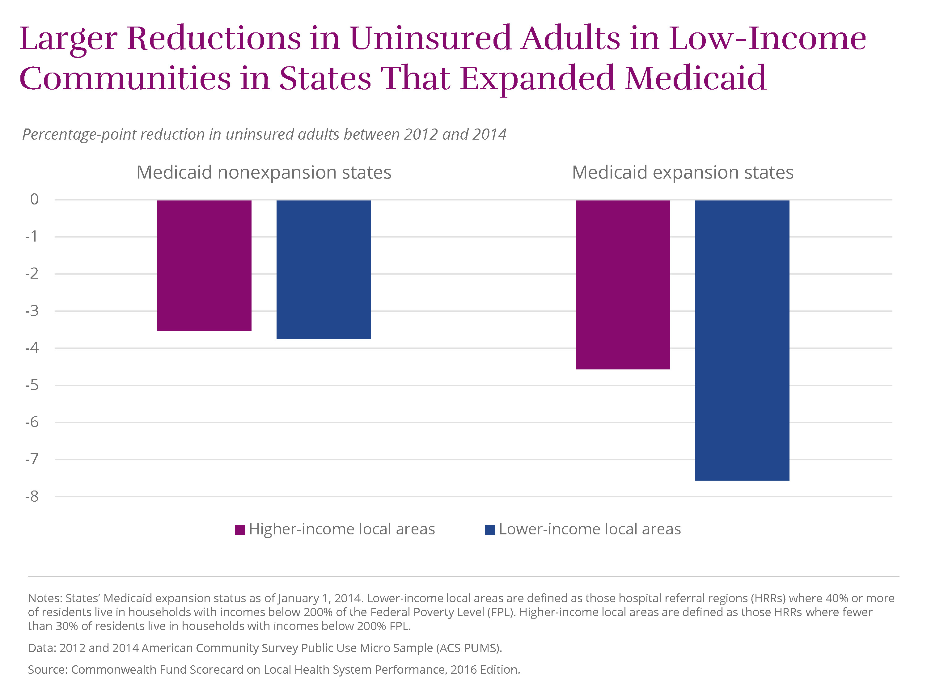
The ACA’s major coverage expansions seem to have led to some of the most visible gains in performance. Between 2012 and 2014, the percentage of working-age adults (ages 19–64) without health insurance fell by four percentage points or more in 189 local areas. Several, including leader Jonesboro, Ark., saw double-digit declines in adult uninsured rates. In states that expanded Medicaid eligibility, communities that are disproportionately low-income realized much larger rate reductions than similar communities in states that did not expand Medicaid
View Chart
 .
.
Another example of policy making a difference is Medicare’s Hospital Readmission Reduction Program, created by the ACA. In October 2012, Medicare began financially penalizing hospitals with high rates of rehospitalization. Although readmission rates had been declining slowly in the years preceding the new policy, the pace of decline accelerated between 2013 and 2014 nationally (as documented by our 2015 State Scorecard). About half of local areas (155 of 306) saw meaningful reductions in 30-day readmissions (of at least 5.3 per 1,000 beneficiaries) between 2012 and 2014. The local areas making the most progress averaged a nearly 30 percent reduction.
Also noteworthy are national quality reporting initiatives, such as Medicare’s Hospital Compare, Nursing Home Compare, and related websites, that shine a spotlight on treatment provided in hospital, postacute, and long-term care settings—all of which have seen clear gains in recent years. For instance, hospitals across the nation have made strides in providing evidence-based care for patients with heart attack, congestive heart failure, stroke, and pneumonia acquired outside the hospital—conditions for which 30-day hospital mortality rates have declined in more than two-thirds of local areas. And a majority of localities meaningfully improved on a composite measure of hospital safety that assesses such things as hospital-acquired infections and adverse events related to surgery or other procedures.
In general, ambulatory care quality did not improve to the same degree as care provided in hospitals and other institutional settings. One exception was the reduction in many places in the percentage of elderly patients prescribed a “high-risk” medicine—for example, one with possibly dangerous side effects for older individuals—between 2011 and 2013. These improvements may largely be attributed to a U.S. Food and Drug Administration regulatory action in 2010 that led to the withdrawal of several medications from the market, a demonstration of the importance of postmarket safety surveillance. (source) See J. Driessen, S. H. Baik, Y. Zhang, “Explaining Improved Use of High-Risk Medications in Medicare Between 2007 and 2011,” Journal of the American Geriatrics Society, March 2016 64(3):674–76.
Stark Geographic Differences
The health care experiences of people living in top-performing areas of the country can be dramatically different from those living in bottom-performing areas. On some indicators, the difference is as much as thirteenfold.
Uninsured rates for working-age adults, for example, ranged from 4 percent in Massachusetts localities to nearly 50 percent in Harlingen and McAllen, Texas, in 2014. Despite the broad gains in health coverage, there are still
many
El Paso, TX
Miami, FL
Fort Myers, FL
Corpus Christi, TX
Longview, TX
Tyler, TX
Panama City, FL
Albany, GA
Beaumont, TX
San Angelo, TX
Monroe, LA
Houston, TX
Ocala, FL
Ormond Beach, FL
Houma, LA
Gulfport, MS
Abilene, TX
Odessa, TX
San Antonio, TX
Waco, TX
places in the country, particularly in Texas and the Southeast, where at least one of four working-age adults remains uninsured.
Infant mortality varied more than threefold across regions in 2012–13, ranging from less than three deaths per 1,000 live births in San Mateo and Santa Barbara, Calif. (similar to rates experienced in Norway, which has among the lowest in the world) to more than 10 deaths per 1,000 live births in areas of Mississippi, South Carolina, and Georgia (rates on par with Serbia and China). Local efforts to reduce infant mortality have made a difference in places such as Stockton, Calif., and Grand Rapids, Mich. (source) For a review, see Centers for Disease Control and Prevention, “CDC Grand Rounds: Public Health Approaches to Reducing U.S. Infant Mortality,” Morbidity and Mortality Weekly Report, Aug. 9, 2013 62(31):625–28, (website).
Performance varies widely within states.
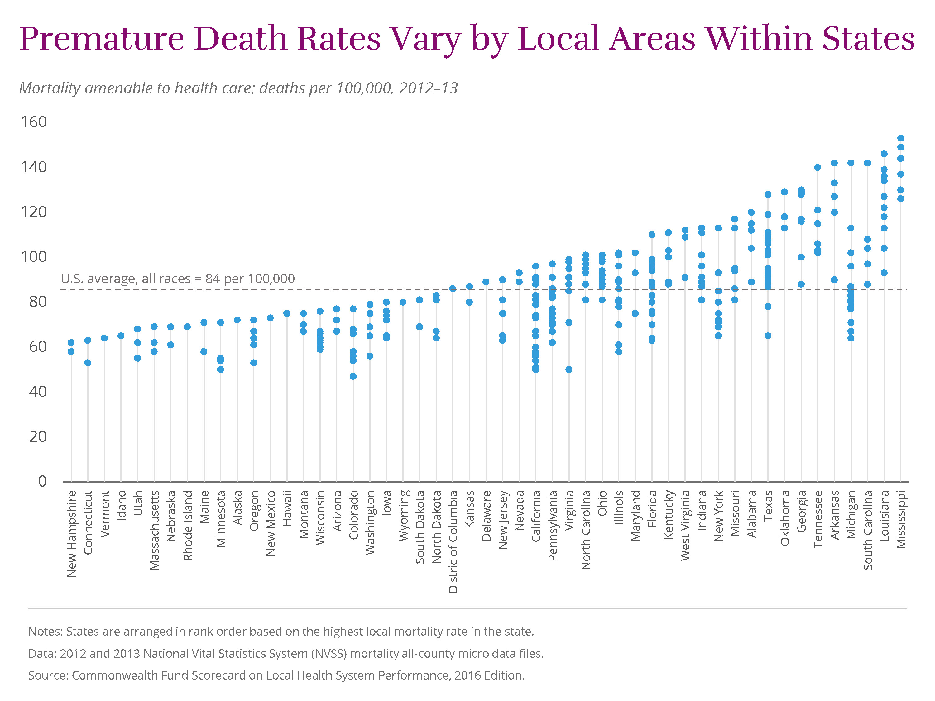
Striking differences among local areas within states point to additional opportunities for improvement. For example, premature deaths from treatable conditions varied more than twofold across Michigan, ranging from 64 deaths per 100,000 in Traverse City to 142 deaths per 100,000 in the Detroit suburb of Dearborn.
View Chart
In fact, on most Scorecard indicators, wide variation exists within many large states. In Texas, the share of adults who reported going without needed care because of the cost varied from 12 percent in Temple to 31 percent in McAllen.
And in Florida, hospital admission rates for younger Medicare beneficiaries (ages 65–74) for potentially avoidable causes ranged from14 admissions per 1,000 in Sarasota to 46 per 1,000 in Lakeland.Costs vary for Medicare and private insurance enrollees, even within the same local area.
The cost of health care varies widely between, and even within, local areas. Per-enrollee spending among Medicare beneficiaries in Miami, Fla., the highest-spending region, is more than double that in Honolulu, Hawaii, the lowest-spending region ($13,189 vs. $5,593). In the working-age population with employer-sponsored insurance, per-enrollee spending differences are even greater, ranging from $2,720 (Columbus, Ga.) to $9,362 (Wilkes-Barre, Pa.)— three Per-enrollee spending estimates for Medicare and employer-sponsored coverage are adjusted for regional wage differences. Estimates exclude prescription drugs costs, and Medicare estimates exclude extra payments made for graduate medical education. times as much.
Even within communities themselves, there is little relationship, and there are big relative differences, between per enrollee health care spending in employer-sponsored plans and Medicare.
View Chart
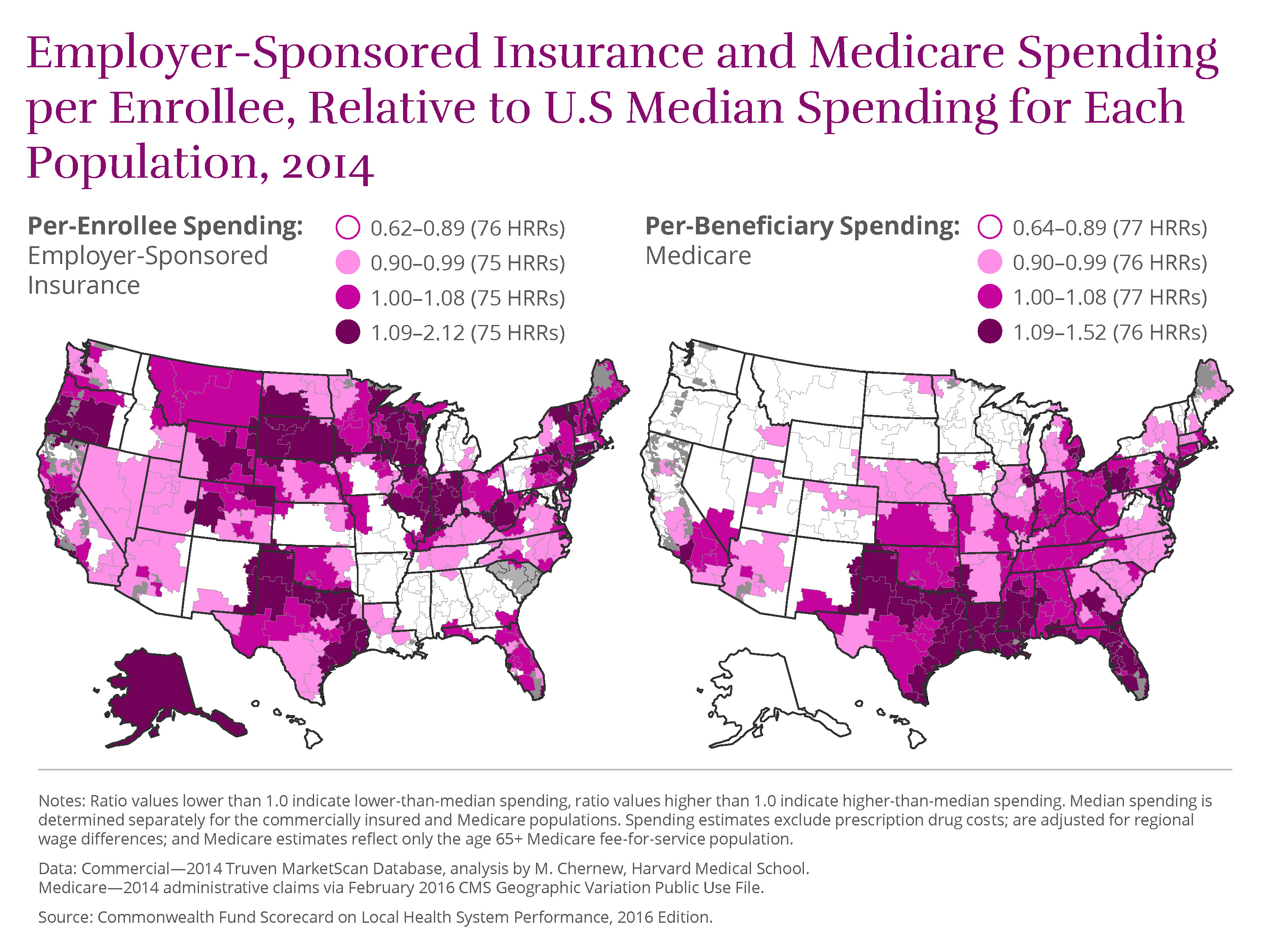 Most areas tend to have relatively high on spending for one population and low on spending for the other. (See Appendix) In fact, only
13
Tucson, AZ
Most areas tend to have relatively high on spending for one population and low on spending for the other. (See Appendix) In fact, only
13
Tucson, AZ
Redding and San Luis Obispo, CA
Honolulu, HI
Boise, ID
Des Moines and Dubuque, IA
Traverse City, MI
Albuquerque, NM
Buffalo and Rochester, NY
Arlington, VA
Spokane, WA
areas have relatively low spending per enrollee (in the lower 25th percentile) for both the Medicare and employer-sponsored, commercially insured populations. In
23
Hudson, FL
Miami, FL
Joliet, IL
Gary, IN
Munster, IN
Terre Haute, IN
Camden, NJ
Hackensack, NJ
Newark, NJ
Paterson, NJ
East Long Island, NY
Manhattan, NY
Elyria, OH
Wilkes-Barre, PA
Amarillo, TX
Beaumont, TX
Dallas, TX
Fort Worth, TX
Houston, TX
Lubbock, TX
Tyler, TX
Victoria, TX
Wichita Falls, TX
areas, meanwhile, spending is relatively high for both populations; these areas, mainly in Florida, Indiana, New Jersey, and Texas, are in the upper 75th percentile of spending.
While higher spending is not always an indicator of inefficiency, particularly if it reflects a sicker population with complex health needs, it is not a reliable barometer of the quality of care delivered or better patient outcomes.
Health system experience in the nation’s largest cities.
Large cities are the nation’s economic and innovation hubs and not surprisingly home to many of the nations’ most well-known hospitals and health systems. The largest U.S. metropolitan areas, comprising 53 local areas, account for 45 percent of the nation’s total population, highlighting the importance of major cities in driving health system performance. Performance across these communities mirrors patterns seen nationally, with wide variation in urban residents’ ability to access affordable care, in the quality of care received, and in health outcomes. (See Appendix) for a summary of health system performance in the local areas making up the nation’s largest metropolitan areas.)
How Local Health System Performance Relates to Income
Local areas with a disproportionate share of low-income residents tend to exhibit worse health system performance than areas with relatively fewer low-income residents. (For simplicity, we refer to these as lower-income and higher-income
areas.
Lower-income local areas are defined as those hospital referral regions (HRRs) where 40 percent or more of residents live in households with incomes below 200 percent of the federal poverty level (FPL). Higher-income local areas are defined as those HRRs where fewer than 30 percent of residents live in households with incomes below 200 percent FPL. These boundaries approximate the interquartile range seen across the 306 HRRs.
) As the
chart
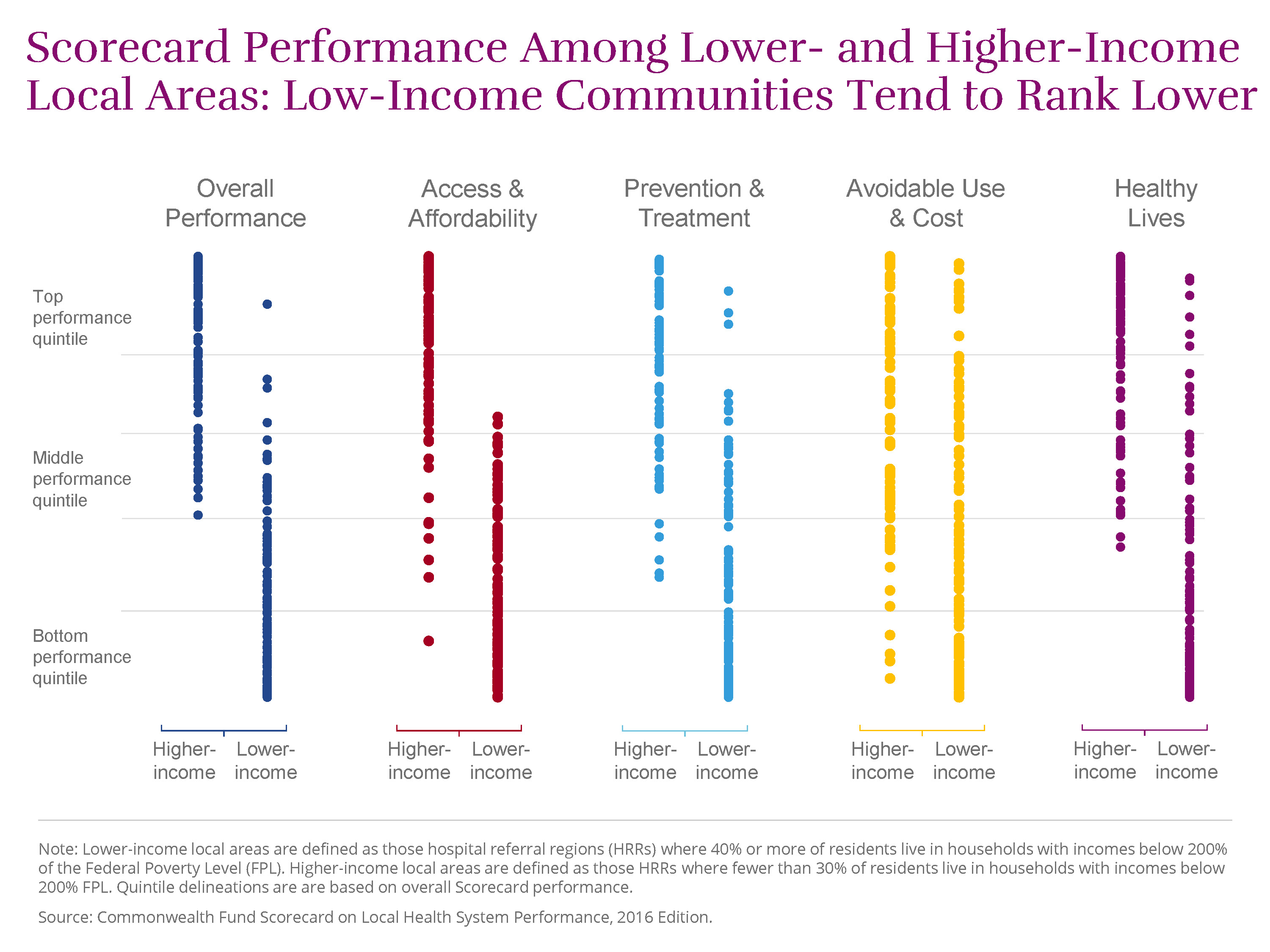 illustrates, lower-income areas tended to rank below higher-income ones on three of our performance dimensions—access to care, quality of care, and health outcomes. However, in each dimension, there were several lower-income communities that outperformed wealthier ones.
Compared to residents of higher-income areas, those living in lower-income areas are:
- more likely to report going without needed medical care because of the cost (19% vs. 12%)
- more likely to receive a high-risk prescription medication (20% vs. 13% among Medicare beneficiaries)
- more likely to die early in life from treatable conditions (106 vs. 68 deaths per 100,000 population)
- more likely to have lost six or more teeth because of decay or gum disease (15% vs. 8%).
Some communities with large low-income populations stand out for their high performance or for the progress they have made.
For example, the Santa Barbara, Calif. region, where 41 percent of the population lives below twice the federal poverty level, ranked 38th overall, putting the community in the top quintile of performance in the Scorecard.
Four
Salinas and Stockton, CA
Eugene and Salem, OR
other lower-income communities ranked in the top two quintiles of performance. And two of the four local areas with the greatest number of improved indicators (Stockton, Calif., and Cape Girardeau, Mo.) have large low-income populations.
Many economically disadvantaged regions were also among the most improved on certain indicators.
As noted previously, Jonesboro, Ark., where almost half the population has low incomes, had the largest decline in uninsured rates between 2012 and 2014. Three Pueblo, COSavanah GA
Hattiesburg, MS lower-income areas saw the largest reduction (9 percentage points) in the share of Medicare beneficiaries receiving high-risk prescription medications, exceeding the national rate of improvement.
Medicare’s payment penalties for high 30-day readmission rates seem to be having their intended effect of reducing rehospitalizations. The Scorecard finds that 30-day readmissions for Medicare beneficiaries fell in the majority of U.S. localities between 2012 and 2014. The reduction was greater in lower-income areas than in higher-income areas (seven vs. five fewer readmissions per 1,000 beneficiaries, respectively).
View Chart
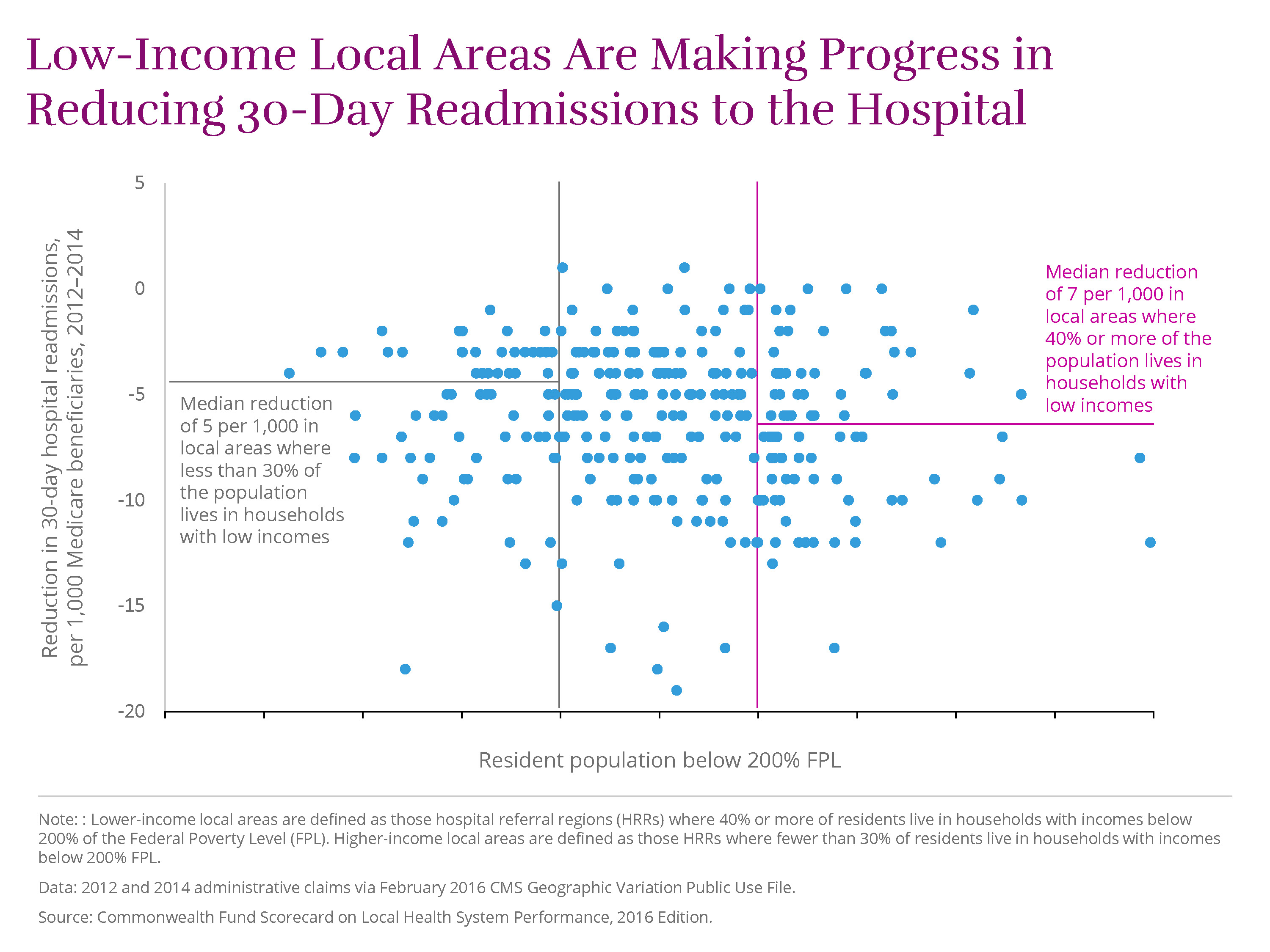 McAllen, Texas, which has the highest proportion of low-income residents, saw the largest reduction of all lower-income areas, with 17 fewer readmissions per 1,000 beneficiaries in 2014.
Opportunity for Improved Performance
As we noted earlier, the performance gains that the Scorecard identifies likely reflect the influence of public policy—most notably Affordable Care Act—as well as the results of public and private initiatives implemented at the national, state, and community levels. The improved performance achieved in many communities, including those where many people have low incomes, suggest that local health systems can take steps to better serve all residents.
By capitalizing on opportunities for improvement, communities can expand access to care, save lives, and improve care experiences for patients. (Click here to see the potential impact of improved performance for each local area.) If all local health systems achieved the benchmarks set by top performers, nationally we might expect the following gains:
-
19 million additional adults and children would gain health insurance (on top of the 2014 gains in coverage achieved under the Affordable Care Act), thus helping to reduce cost barriers to needed care.
-
18 million fewer adults would forgo needed care because of the cost.
-
11 million additional adults would receive recommended cancer screenings, while 26 million more would receive recommended vaccines.
-
Medicare beneficiaries would have 1.4 million fewer emergency room visits for nonemergency care or conditions treatable with primary care.
-
There would be 100,000 fewer premature deaths before age 75 for conditions that can be detected early and treated with effective follow-up care.
-
11 million fewer adults (ages 18–64) would lose six or more teeth from decay, infection, or gum disease.
The Scorecard’s findings are also a reminder that where you live matters. While pockets of high performance exist and progress is more widespread in recent years, the sobering truth is that some people benefit more from their local health care delivery systems than others do.
Many opportunities remain for improvement in many places across the country. For example, adult obesity rates rose in 111 of 306 areas between 2011–12 and 2013–14, which may portend a worsening in chronic conditions in future years. And rates of premature death from treatable medical conditions were mostly unchanged in the years measured by the Scorecard (between 2010–11 and 2012–13).
Over the long term, federal and state policies may be required to address socioeconomic inequities and ensure that all communities have equal opportunities to improve. But as the Scorecard indicates, community and local delivery system leaders across the country are already demonstrating the power of innovation and collaboration to promote health. The examples highlighted in this report offer encouragement that, even over a relatively short time, health care professionals and local leaders can rise to the challenge of meeting their community’s health needs.